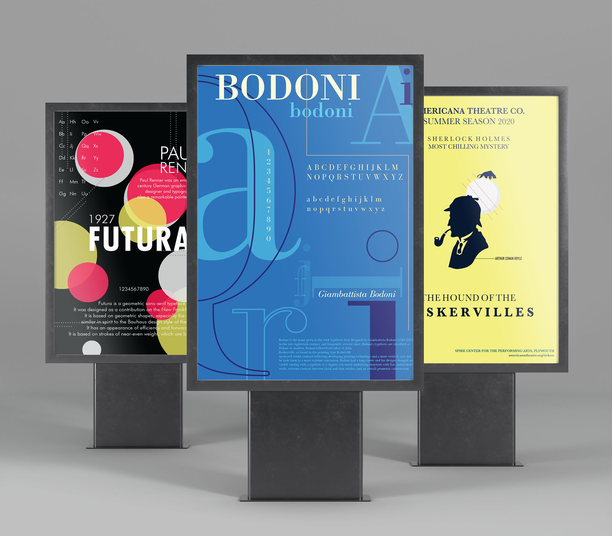
Typography: Typeface Broadsides
Broadsides have been an aspect of typography and printing since the earliest era of type design. Printers and Typographers would print a catalogue of their available fonts on one large sheet of paper to present it to the prospective buyers.
Typography is a craft in its own right — a literary craft historically linked to the disciplines of editing, printing, and publishing. The Importance of Typography in Print it is often overlooked. Typography is extremely important in printed marketing materials, whether a leaflet or a poster, your printed marketing materials have to be reader friendly. It impacts how it is received by the reader and good typography can convey feelings, reinforce brand image and speak to the reader. It is as important as the colours and the imagery used on your printed materials and should be given the attention it deserves.
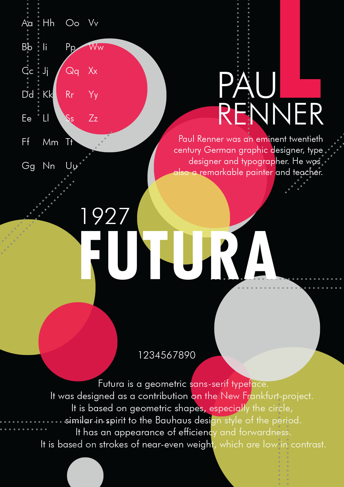
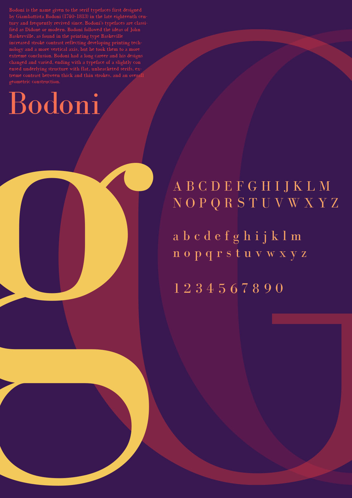
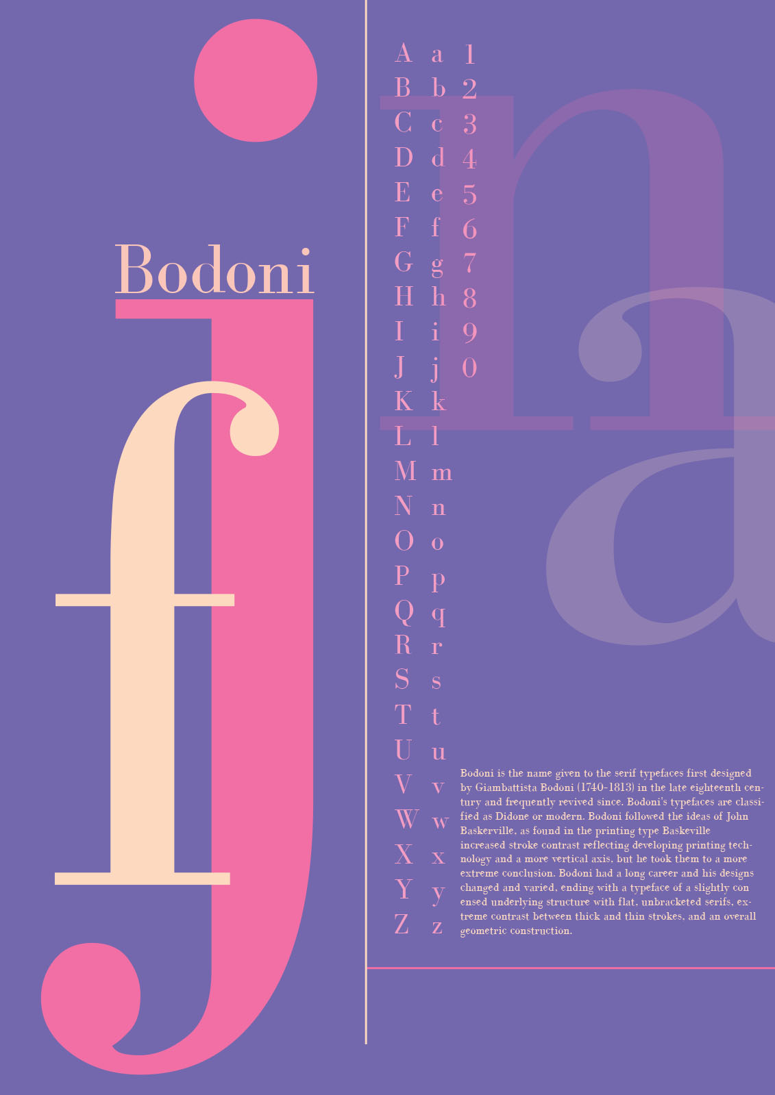

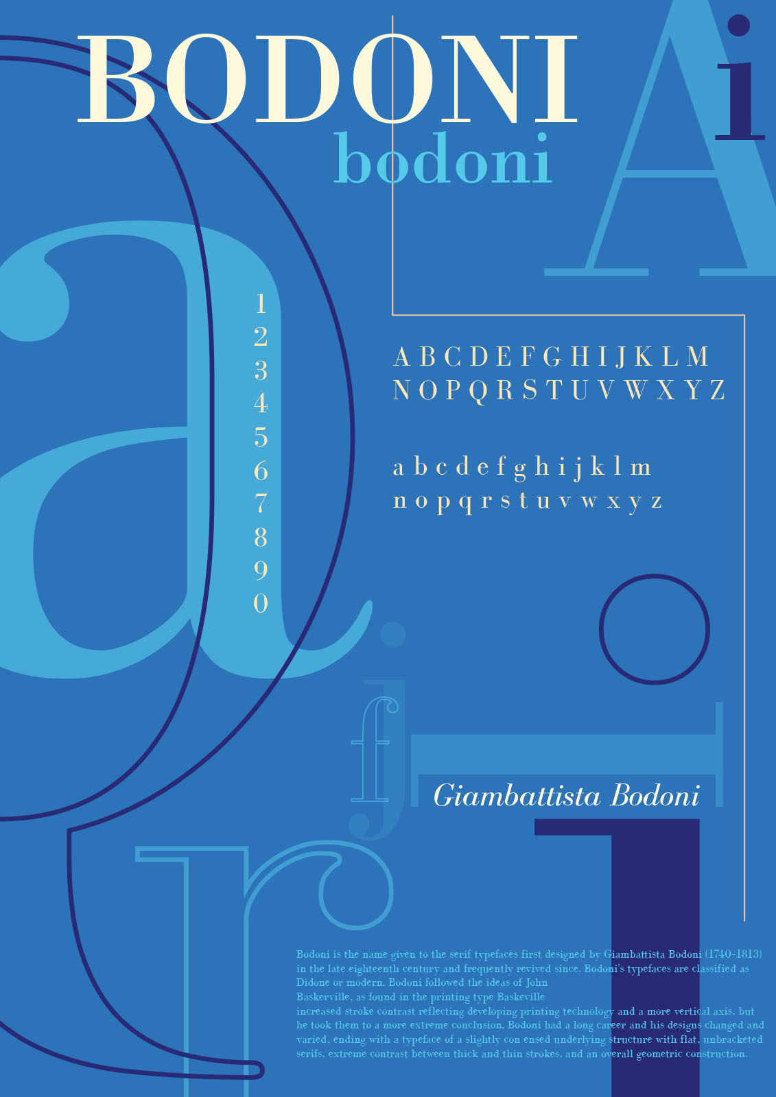
We tried to recreate the same using modern tools and digital aspects of typography without compromising on the core principle. For this project, our 2nd year students created sets of 2 posters about a specific typeface to promote the look & feel, anatomy and visual flair of the typeface. One poster will deal with the typeface alone, cataloguing the face and providing information about the type designer and the second poster will present a visual analogy of the typeface that combines both type and image, to broaden the viewer’s knowledge of the type. Here are some selected posters to glance at.
If you care to learn further about how workshops are structured at LISAA School of Design, please click below to get in touch with our team.