
What’s my type?
Talking Typefaces
Fonts are everywhere. Throughout the day, we come across hundreds of different typefaces, and font styles, in different colors, sizes, and places. And yet, we never really pay much attention to them. Have you ever stopped to think why a certain typeface was used for that brand ad you saw on Instagram? Or why, when you open MS Word, you’re always greeted with the modern-looking Calibri?
There’s actually a lot more that goes on behind the scenes in finding the perfect font for various purposes. Every typeface comes with a story of its own – how it came into existence, what it was meant to be used for, and how it evolved to where we see it today.
But before we go back in time, some of you might be wondering – what’s the difference between a typeface and a font? A typeface is a style of lettering. The way the letters are designed. The font is the variations of a typeface – its size, height, etc. So, in simple terms, a typeface is a larger term that has a collection of related fonts.
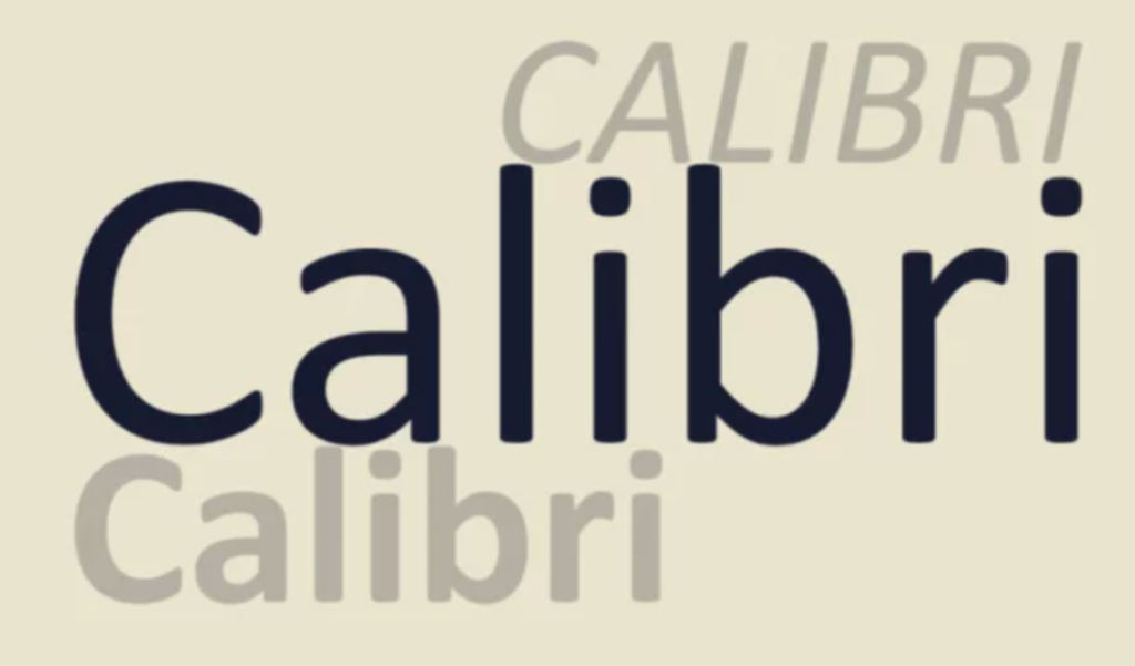
Why Calibri replaced Times New Roman
Moving on from the much-hated font, let’s discuss another font designed to replace Times New Roman, but one that has been quite a success. Yes, we’re talking about Calibri. In 2004, designer De Groot was hired by a secret client to work on a modern font optimized for screen reading. The client turned out to be Microsoft, who was looking for a font to replace their default font Times New Roman. Calibri has maintained its status as the default font for Microsoft Office Suite for almost a decade before being reined in 2021.
But why did Microsoft want to let go of Times New Roman? The reason is simple.Times New Roman was designed specifically for print. The Times commissioned Stanley Morison to compose a font that would give them a contemporary look to the newspaper. The letters were kept narrow with less spacing between them, to fit more text per page. With a lot more work to happen online in the coming future, there needed to be a font that looked good onscreen.
The use of Calibri also highlighted another interesting thing. It originated from a font family commonly used for larger mediums like headlines, shedding a light on the switch to shorter, snappier writing becoming the norm in the upcoming future.
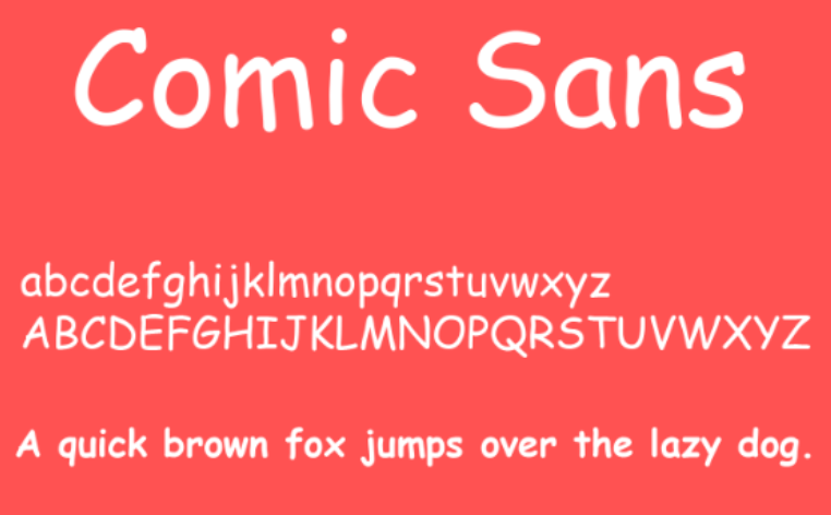
The Infamous Comic Sans
So, now as that’s out of the way, let’s start with one of the most hated fonts of all times – Comic Sans. As you might or might not be aware, Comic Sans has received a tonne of backlash and has often featured at the top of The Ugliest Font lists.
However, the font in itself is not a bad one. Comic Sans was in fact developed to add some fun to the speech bubbles of an animated cartoon dog that would help people navigate the Microsoft Windows interface for the first time. Times New Roman was perceived to be not a great fit for a comic dog. Comic Sans was created as a lively and friendly alternative inspired by comic books and designed to look handwritten.
The reason it has a bad reputation is because of the way it started being overused in everything. From signs to billboard ads, to even formal documents. Those are not the places where you would want to see a kid’s font. No wonder it still offends people to this day!
The way Digi Grotesk transformed digital.
Talking about the evolution of typefaces due to the influence of digital makes it important to also talk about the very first font used digitally to see how far we’ve reached. Digi Grotesk was designed by Rudolf Hell in 1968 and was the first proper font meant for the digital platform. It increased readability while also reducing file size, paving the way for innovation in typography for digital.
The first font used in print
Going back a little more in history, from the first font for digital, we would also like to talk about the first font ever formally used – Blackletter. The Germanic Lombards invented this font, which was marked by its bold and ornate design. Also known as the Old Gothic script, it was adapted by Johannes Gutenberg for his press. Even though it did not provide clear readability, it set the tone for typography to become a thing, without which we wouldn’t have been able to reach where we are today.
Apart from the fonts we are talking about, there are many more fascinating stories that are unheard of. Be it the beloved Helvetica, the quirky-looking Papyrus, or Arial, with its humanistic characteristics. We’ll be coming back with blogs in the future with many more stories about different fonts and typefaces. Meanwhile, if this is what fascinates you, it might be time to explore your interest in Graphic Design course at LISAA School of Design which is filled with interesting curriculum that will help satiate your curiosity and launch a fulfilling career in the field. Check it out here